What happens to passenger engagement and satisfaction when the moving map is no longer a map? We’re about to find out, as the industry integrates new and innovative ways to display flight progress and other details, thanks to an evolving technology stack and creativity from airlines and service providers.
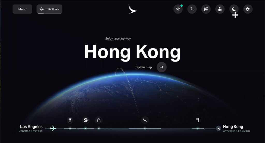
Leading the charge on this front is Cathay Pacific, with its “My Journey” entertainment experience, powered by FlightPath3D. Passengers are welcomed to the IFE with an animated fly-through of the trip route, highlighting not just where the plane will be going but what travelers can expect from on board services during the trip. Ultimately the goal is to engage passengers more quickly on board, and to deliver a more integrated experience overall.
We’ve transformed the typical journey into an interactive adventure, enhancing our passengers’ experience in the skies. This initiative cements Cathay Pacific’s role as an innovator, delivering a travel experience that’s both engaging and intuitively designed for our passengers.
– Mavis Keung, Customer Experience Manager at Cathay Pacific
Key to this next generation of map-based experiences is the integration of API-based widgets throughout the inflight entertainment experience. Built on the same core mapping data and details, chunks of journey data can be separated out from the full map and integrated into nearly any facet of the entertainment experience. As a movie ends, for example, the airline can choose to integrate a flight progress overlay on the credits screen.
Initially launched on Cathay Pacific’s A350 aircraft, the My Journey offering is set to expand to additional models, including the 777 and A321 aircraft.
“By providing our cutting-edge technology, we have seen our vision come to life in a uniquely configured, intuitive interface,” added Boris Veksler, Chief Executive Officer of FlightPath3D. “It’s a milestone in our commitment to reshaping how passengers interact with their journey.”
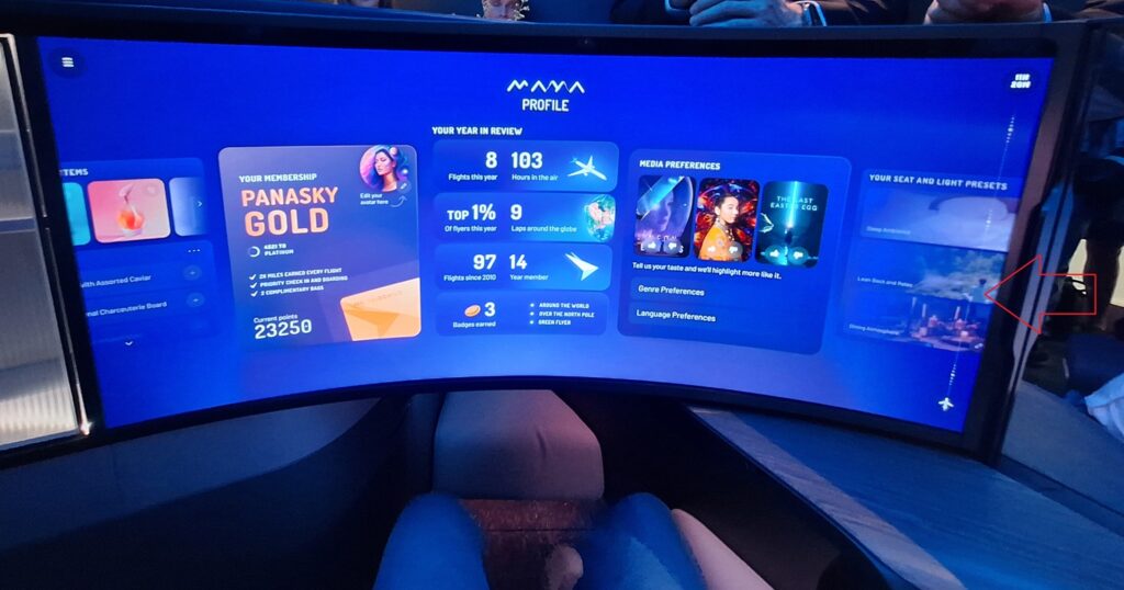
FlightPath3D is not alone in pursuing this approach to the map experience, though it is in the lead. Panasonic Avionics‘ Arc solution promises a similar modular concept for its map customers. At the unveiling of the MAYA concept seat last month PAC showed a version of the IFE experience with a persistent, vertical travel progress ribbon to the side of the entertainment content.

Safran Seats teased a similar concept in its new “secret room” business class seat at AIX, but the progress was shown embedded into the seat, not on an IFE screen. Both of these approaches, however, are still in development.
Ultimately, the flexibility made available to airlines to render data outside of a traditional map is good news. It allows airlines to be more creative with the content, surfacing different bits at different points of the trip. And, more importantly, it allows airlines to take advantage of the data that passengers find so compelling – the map is the most popular IFE content for a reason – while getting them out of the traditional map interface and engaging with other content on board. That could mean more revenue opportunities for airlines, or just a better travel experience for travelers.
A favor to ask while you're here...
Did you enjoy the content? Or learn something useful? Or generally just think this is the type of story you'd like to see more of? Consider supporting the site through a donation (any amount helps). It helps keep me independent and avoiding the credit card schlock.

Leave a Reply